Brief -
To rebrand AnxietyUk, based on a personal experience and having the mindset of being a strong advocate for mental health. The whole project will be focused on taking their brand and how it could be improved to both indicate the message and services the brand hopes to promote. This message is that it's "OKAY" to have anxiety and it's a perfectly normal part of life.
This brief will be a follow up to my previous project on Depression, looking at a different aspect of Mental Health. Whereas the first project was based on a selfish purpose in using it to vent for myself. This project will still be focused around something I am currently going through but the intention is to raise awareness with the purpose of me showing that there is no need for stigma in being open about mental health whether that's to people in my class or followers of my work.
The project will start by exploring how the brand's identity could be improved from the logo design to the website design but expanding the project to develop a app that will allow users to record their feelings or rate their current mood. The purpose of the app is to highlight trends or consistency within someone's anxiety or mood in general,
Brand Background -
AnxietyUK is a national charity based in Manchester, in which they were founded in 1970 by someone living with agoraphobia for those affected by various anxiety disorder. The charity is a member of the Association of Mental Health Providers, meaning they are able to relieve and support those living with Anxiety.
Personal Experience with Anxiety -
Throughout this project, I have used it to really connect with the people who follow my work with the intention to show others that it's okay to express how we feel. This was mainly done through Instagram or Twitter and even Snapchat, I wanted to be fully transparent to show where either my mindset is or how my mental health is improving/getting worse. I didn't want to hold anything back, if I did that would lose all purpose of this project.
Mood Board and Research.
To start this project, I looked at how the current branding could be improved by breaking down various aspects of the design to highlight key positives and negatives that should be converted or removed in the new logo.
For research, I wanted to look at various forms using books, online portfolios and even libraries to gather as much as I possibly could on design for mental health, such as Scott Carroll's Mental Health & Suicide project and print based forms like branding for Cystic Fibrosis by Johnson Banks found in Logo Design Love.
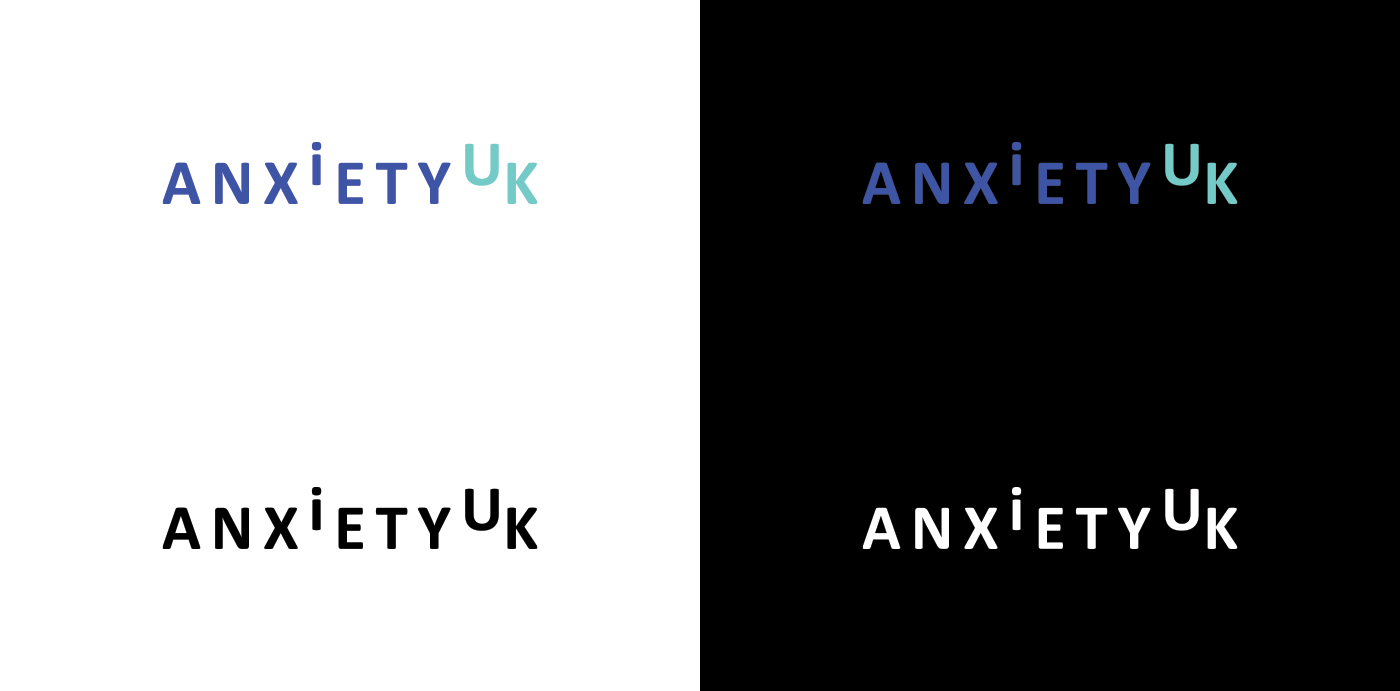
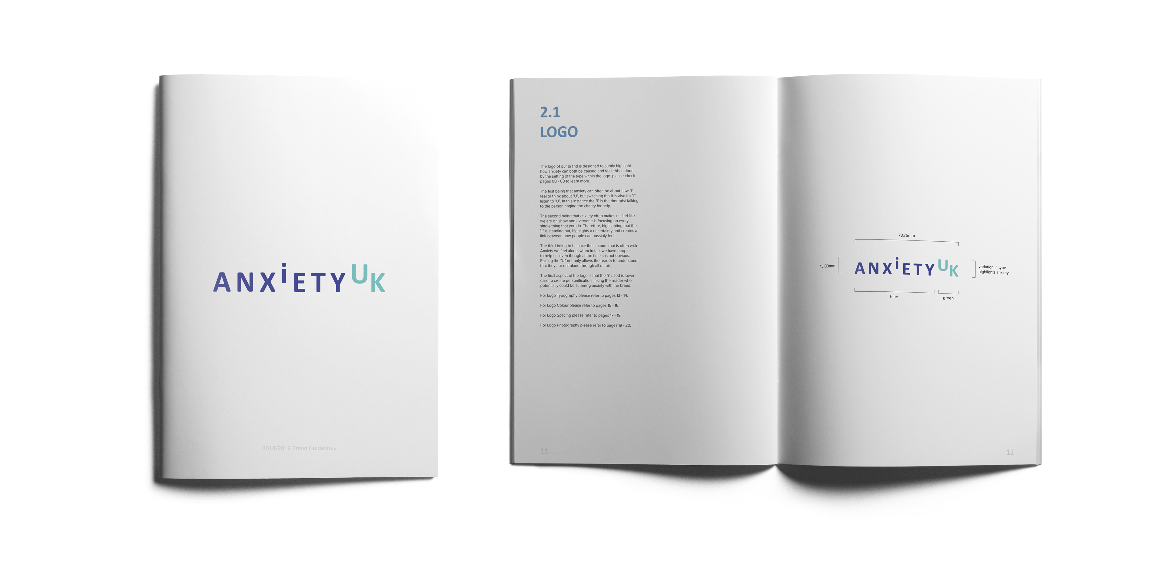
Brand Mark
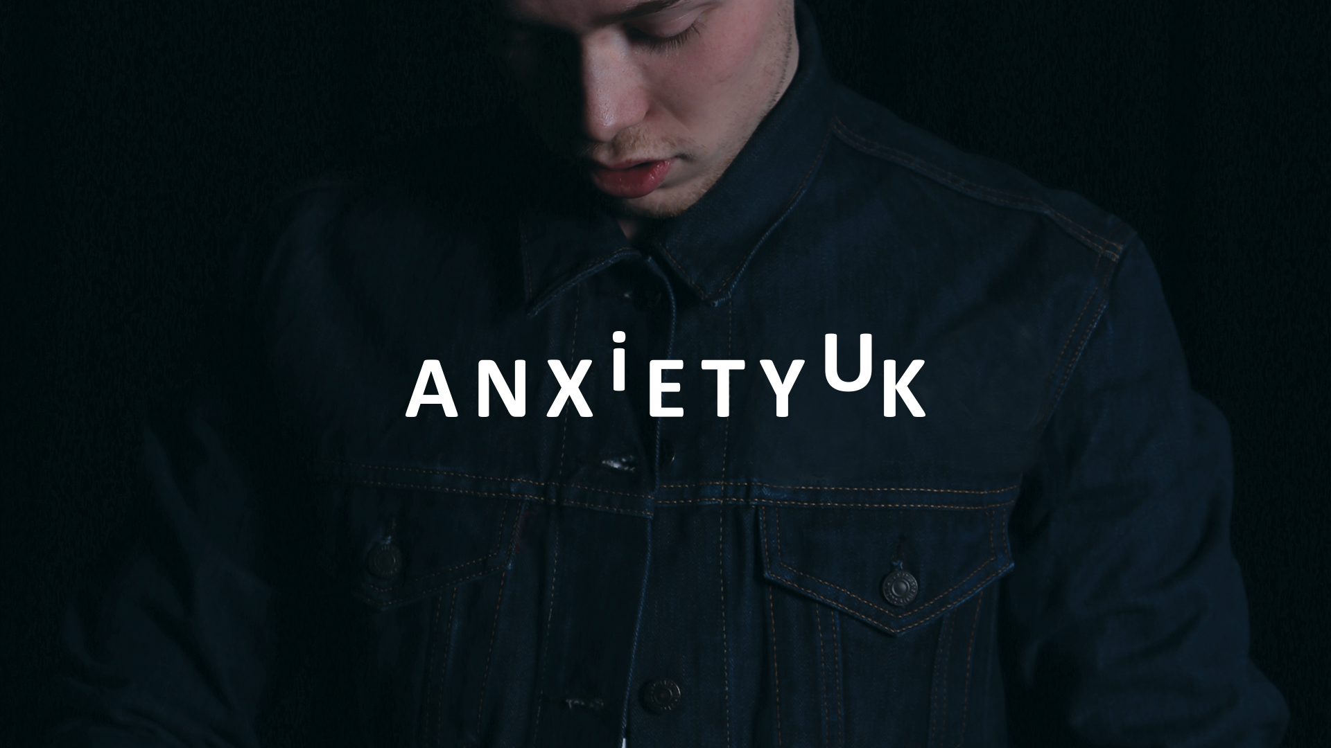
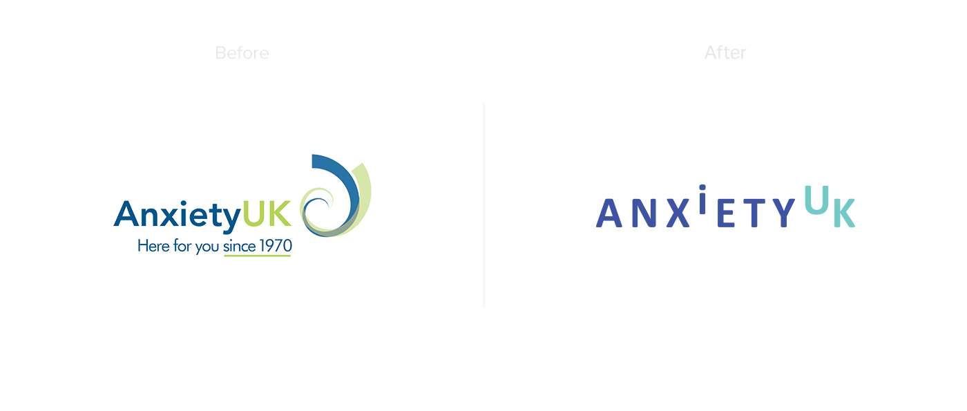
The finalised mark, is to subtly highlight how anxiety can both be caused and feel, this is done by the setting of type. Firstly anxiety can often be about how "i" feel or think about "U", this can be flipped to mean that "i" listen to "U". In this instance the "i" being the therapist talking to the person ringing the charity for help. The second meaning behind the mark is that anxiety can make us feel like we are constantly on show, and that everyone is focusing on every single thing that you do. Therefore, highlighting that the "i" standing out, creates a uncertainty and a links between how people can feel. Balancing the previous statement, anxiety can make use feel alone, when in fact we have people to help us, even though that the time it is not obvious, Raising the "U" allows the reader to understand they are not alone through all of this. The final aspect of the concept is that the "i" used is lower case to create personification linking the reader who potentially could be suffering anxiety with the brand.
Final variations of the logo in Colour, Black and White that are supported by both Gradient.
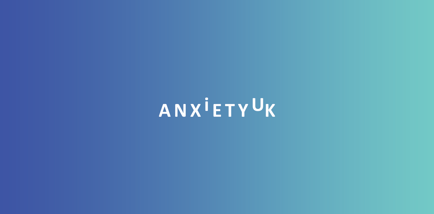

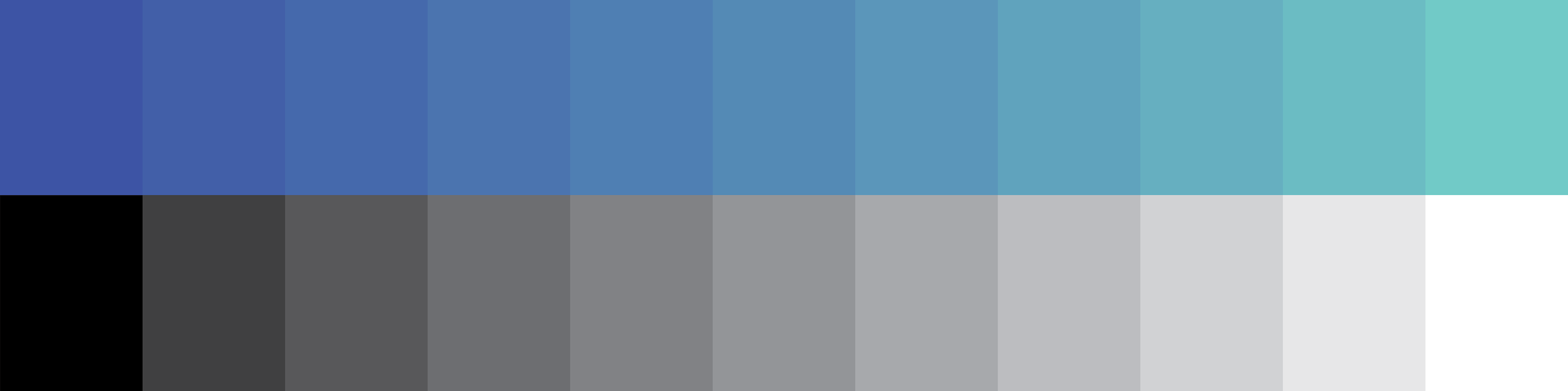
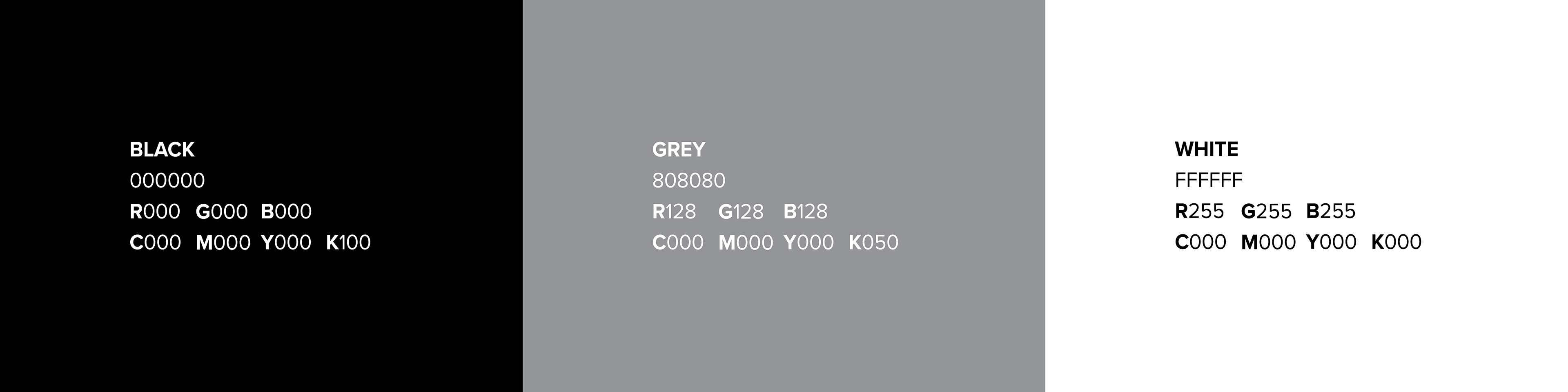
Brand Colour
The brands primary palette is designed to represent "Calm", "Fresh" and "Inviting". The Blue and Green compliment each other, making the overall branding feel trustworthy and suited towards bettering mental health. These colours are found in every aspect of the brand from the logo to business cards and even the app. The brands supporting palette represents "Anxious", "Emotionless" and Negative". These will also be found in every aspect of the brand from colour of type to mood of imagery.
Brand Typography
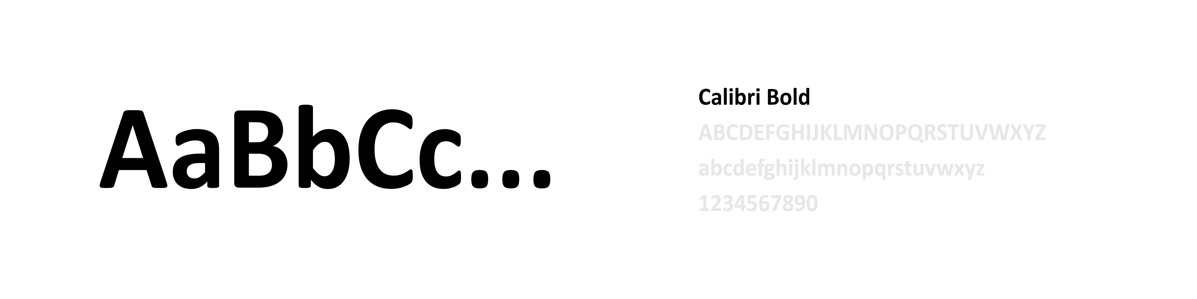
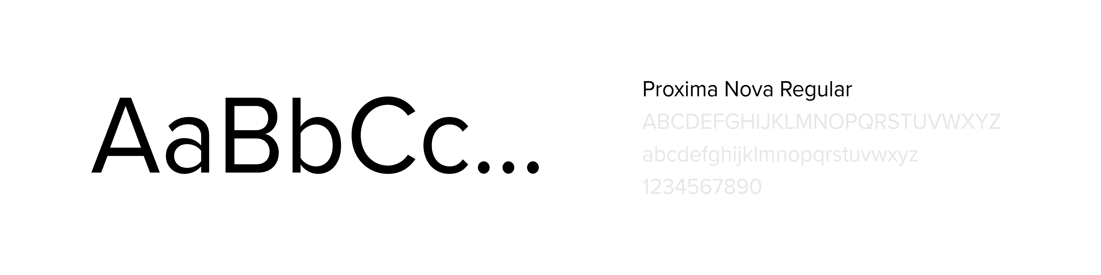
The brand typography for the logo needed to reflect the values of the primary palette, that being "Calm" and "Inviting" therefore the usage of a rounded Sans Serif, like Calibri Bold was the best option. The type will be set extensively to allow the brand to feel inviting and eye catching, making assets such as the posters feel bold.

Brand Photography.
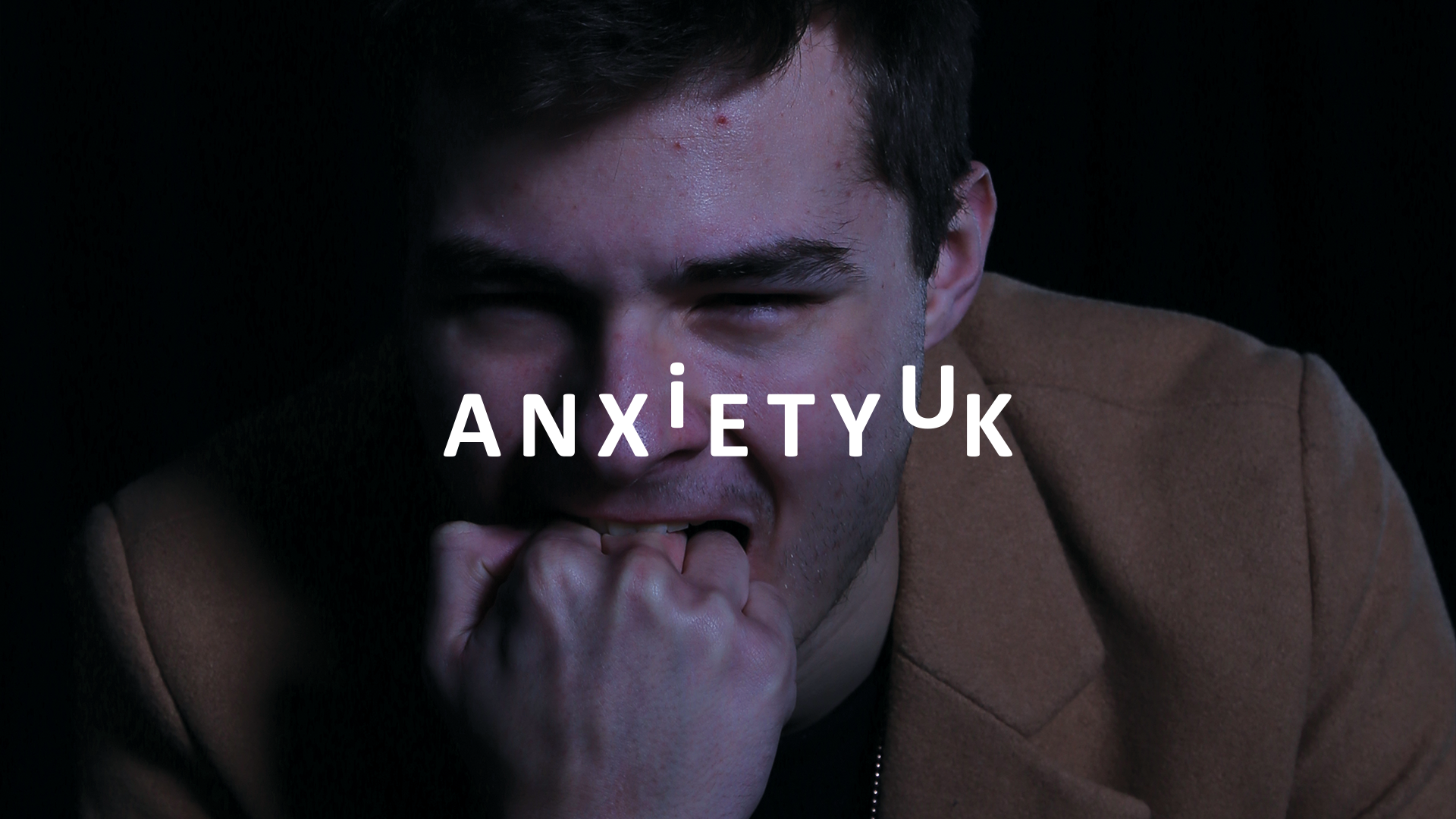
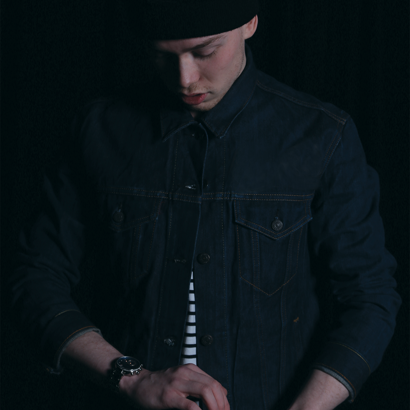
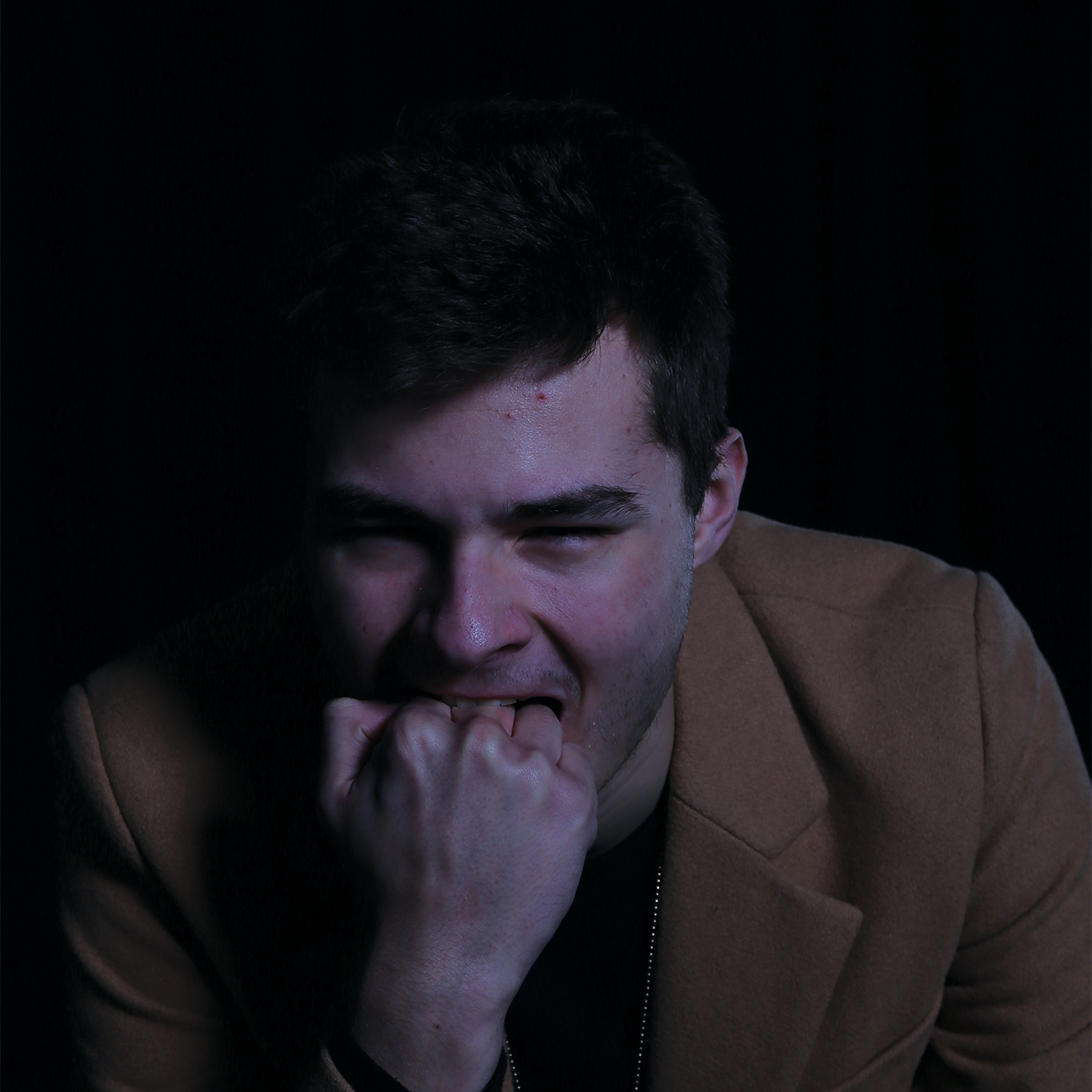
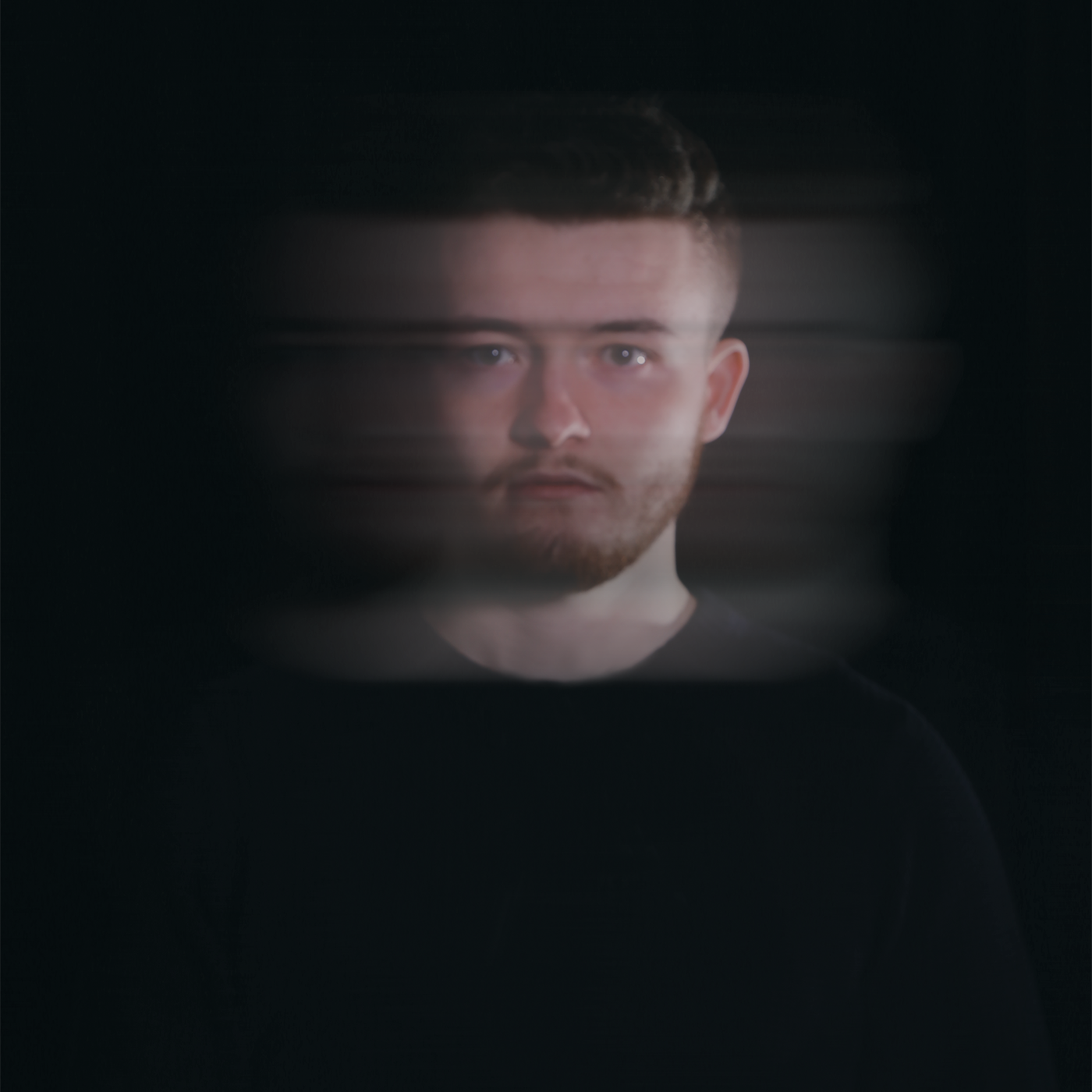
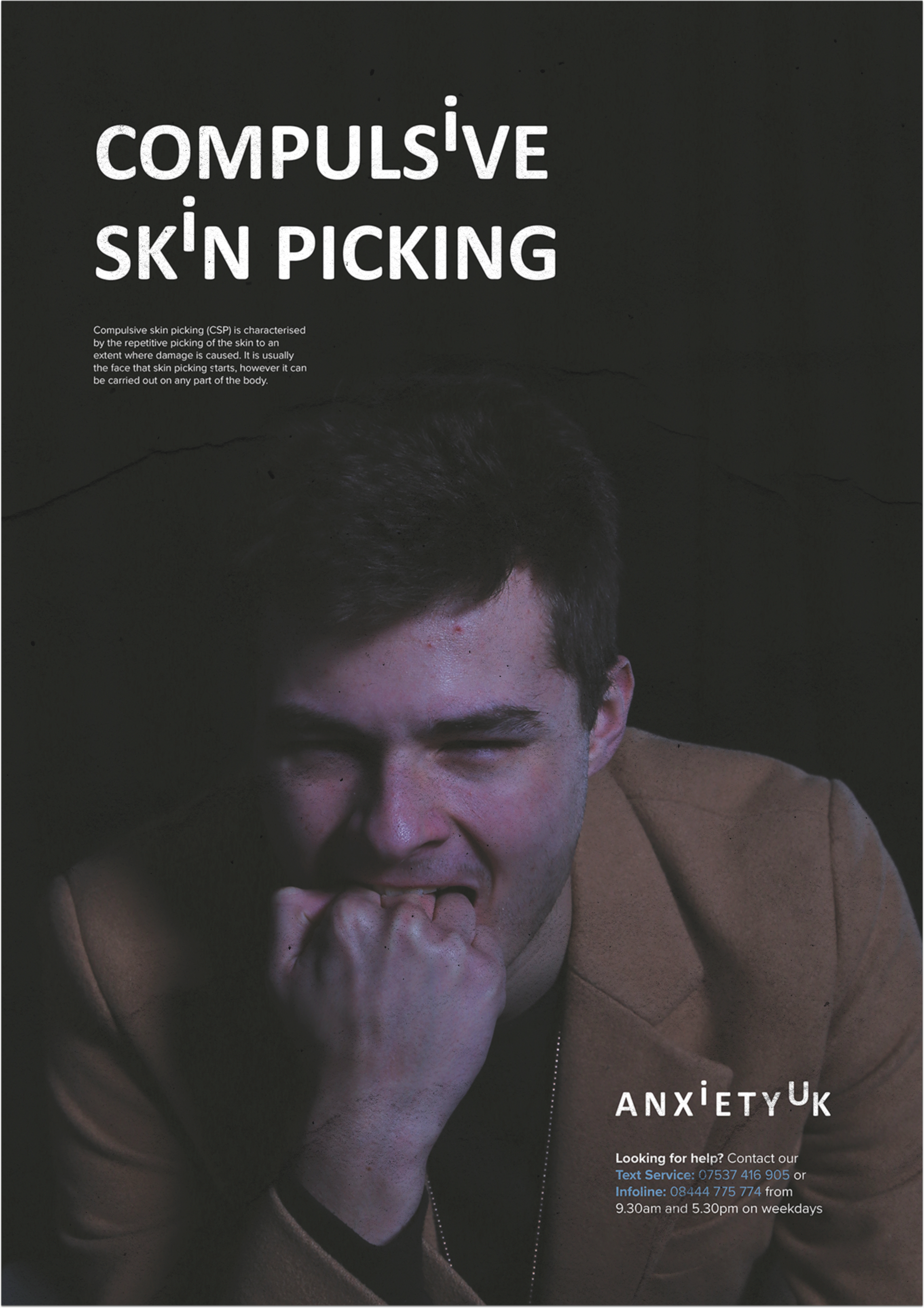
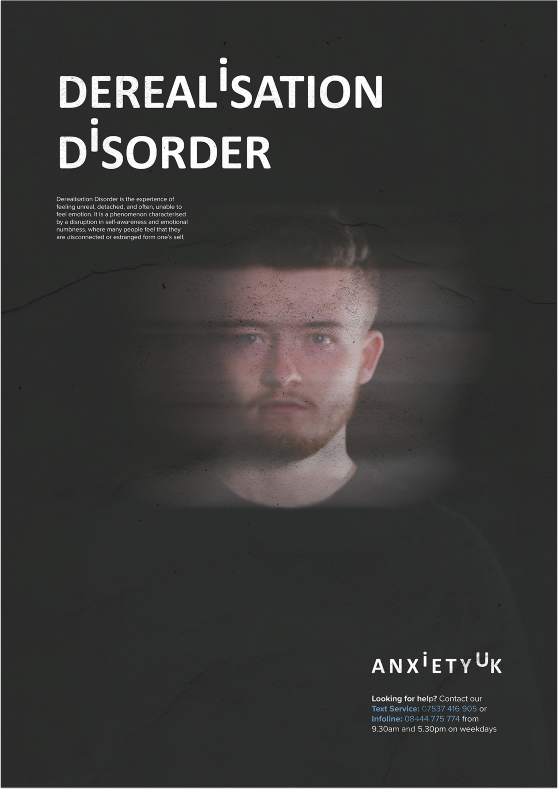
To support the message of this project, I wanted to develop my own range of photography that shows a mixture of how Anxiety feels and how various types can be perceived by the sufferer on the inside and the outside. The imagery needed to be dark to create a sense of fear that showed the person feeling alone or scared. The brand photography was photographed by Matthew Perry, however the shoots were discussed heavily between us both prior and during the shoots.
Shoot One - February 20th 2018
Shoot Two - February 27th 2018
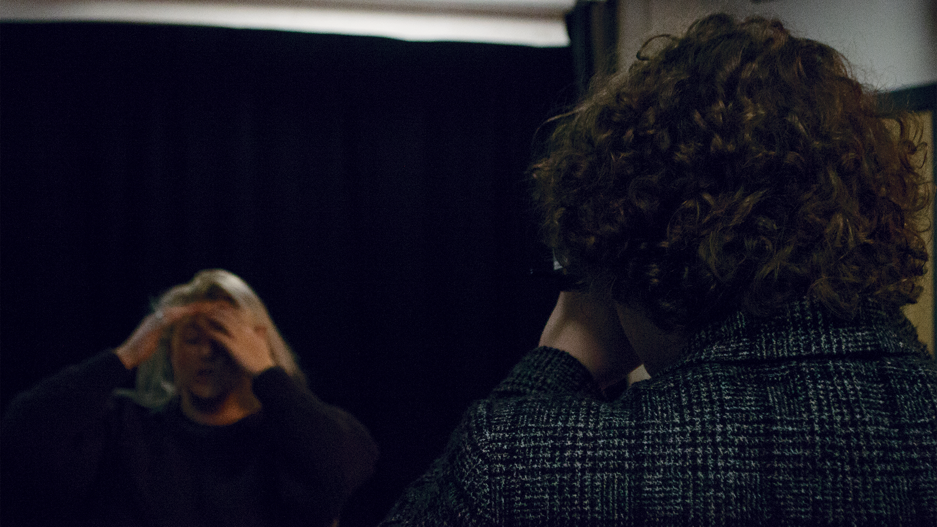
Final Photography
The chosen imagery, needed to communicate the right message but feel strong and balanced in terms of editing and potential in how they would be used throughout the branding. It was important not to choose imagery that felt lacklustre or extremely overpowering but hit the criteria perfectly.
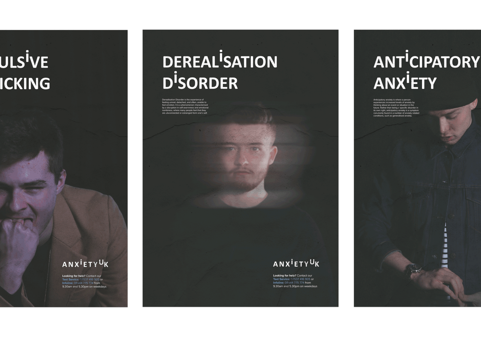
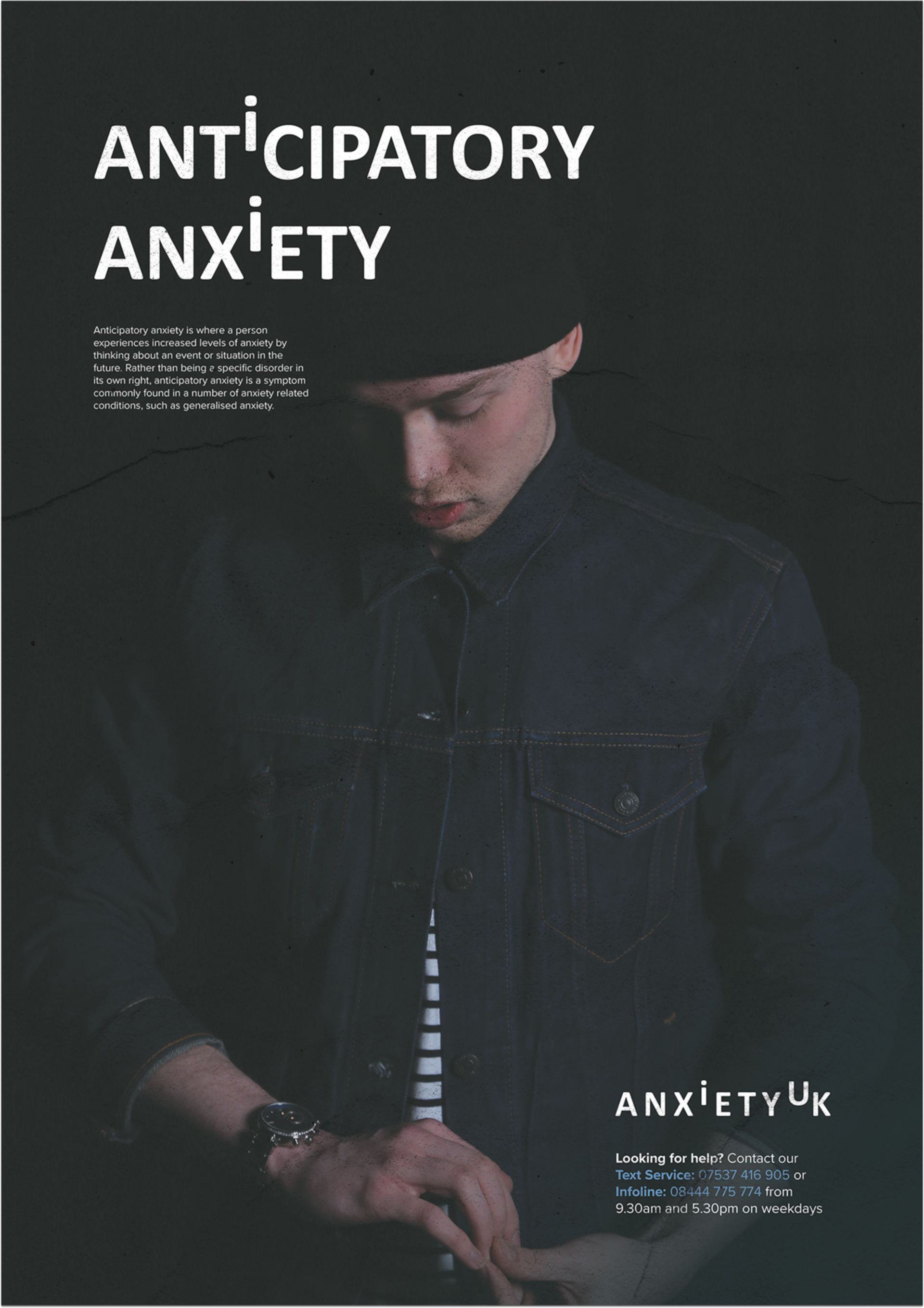
Poster campaign
Decided to create a poster campaign that promoted two things, the first being that its okay to talk. The second being the various types of Anxiety that most likely are unheard, but once people understand them. They can easily be recognisable. The purpose of this was to allow the reader to relate to the brand more, rather than promoting Anxiety overall. Breaking it down, felt like a more suitable option for raising awareness.
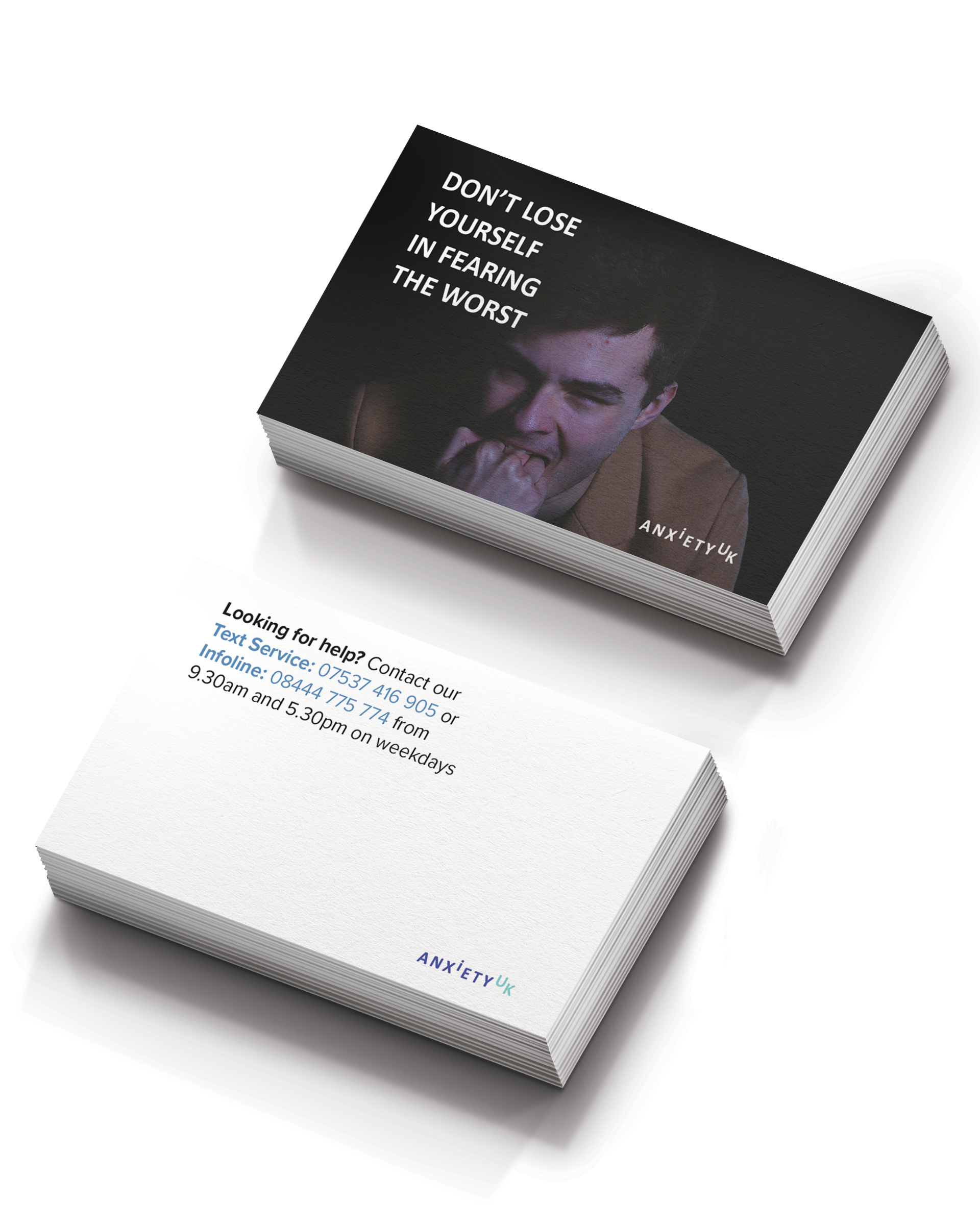
Business/Contact Cards
While the poster campaign will attract the attention of the public or even the victim of ill mental health, the business cards will allow them to have a constant reminder they are never alone. Designed to fit a wide range of both wallets and purses, these cards will allow the holder to contact the brand at any given time during the operating hours.
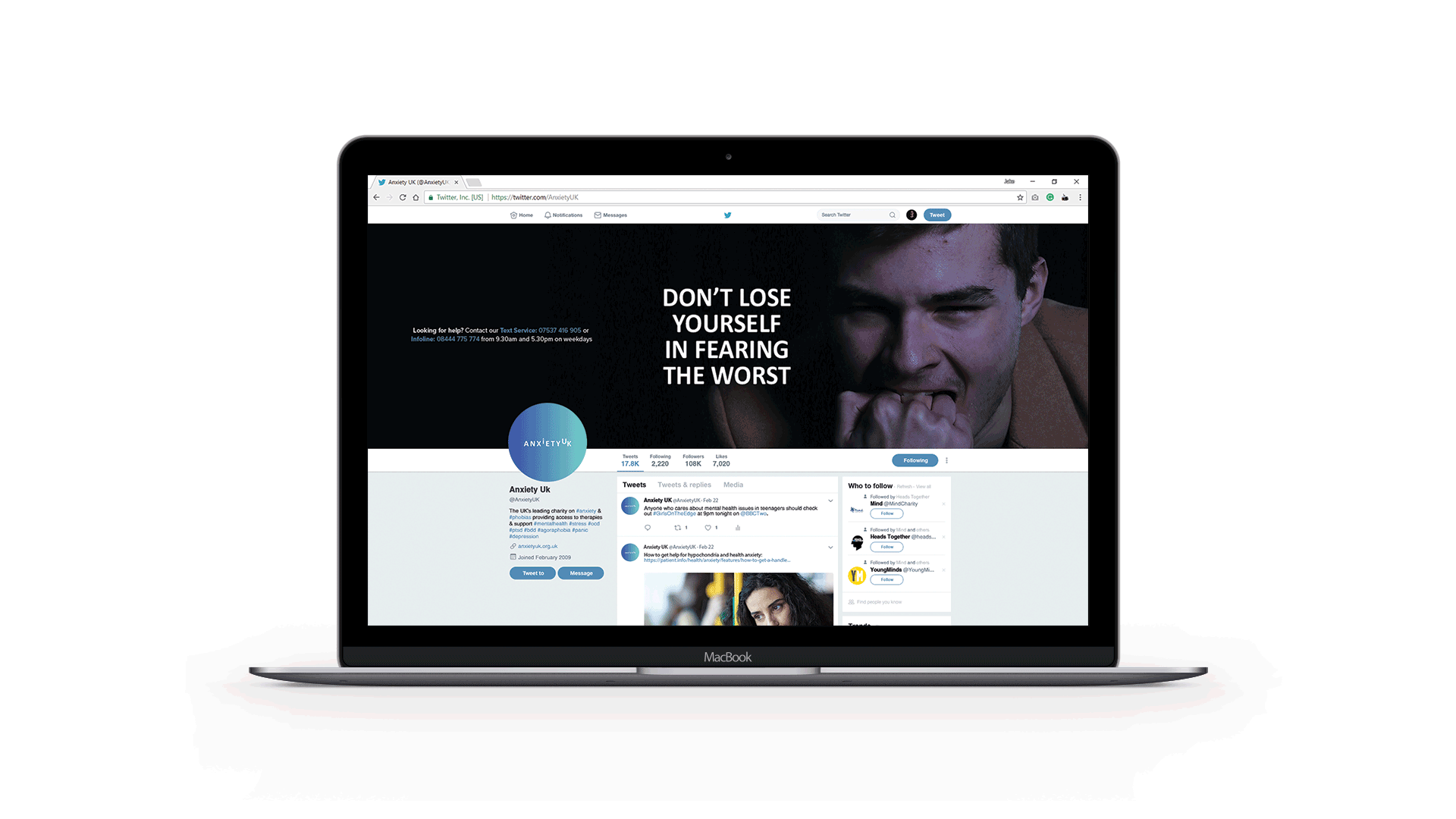
Social Media
AnxietyUK has a fairly strong presence on Social Media having over 100K followers on Twitter, the brand connects daily with followers and potential future members. Therefore developing a range of banners that expanded their message across their current social platforms was the best solution for creating maximum brand awareness.
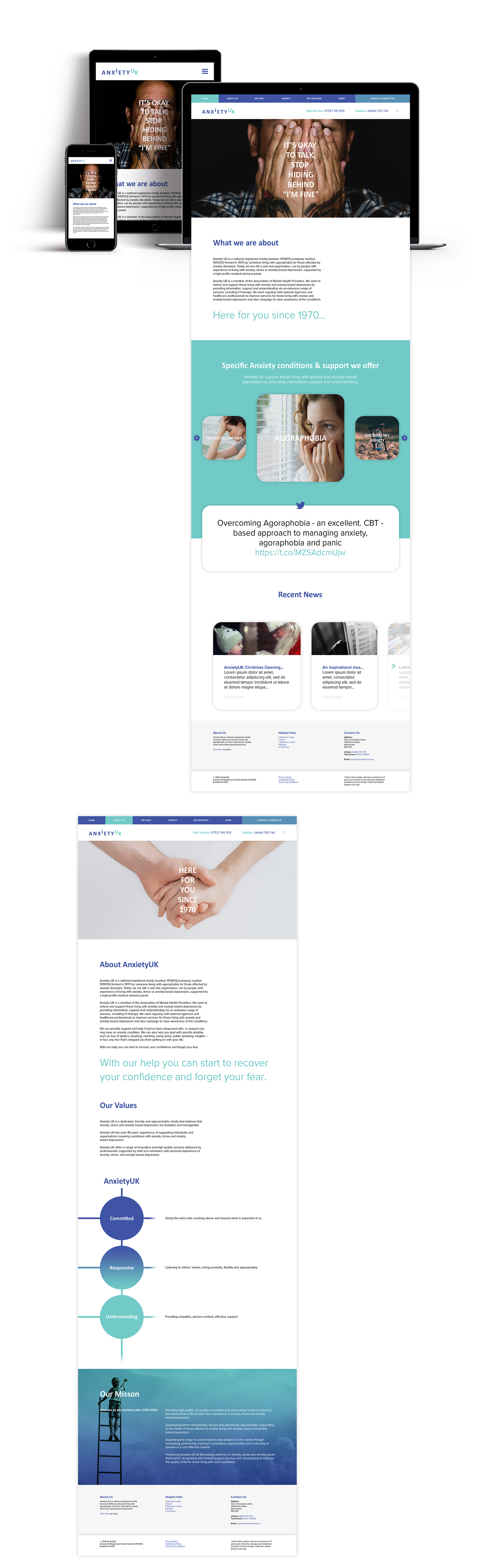
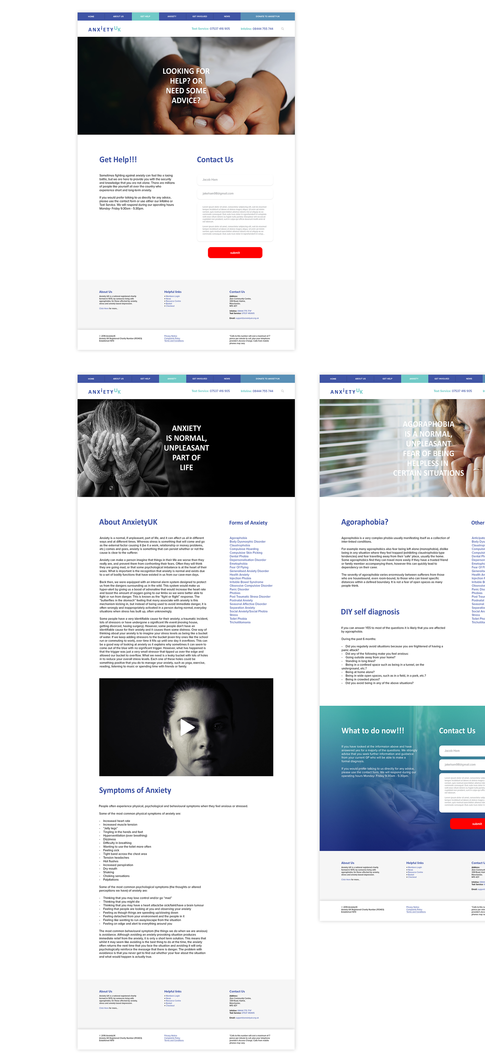
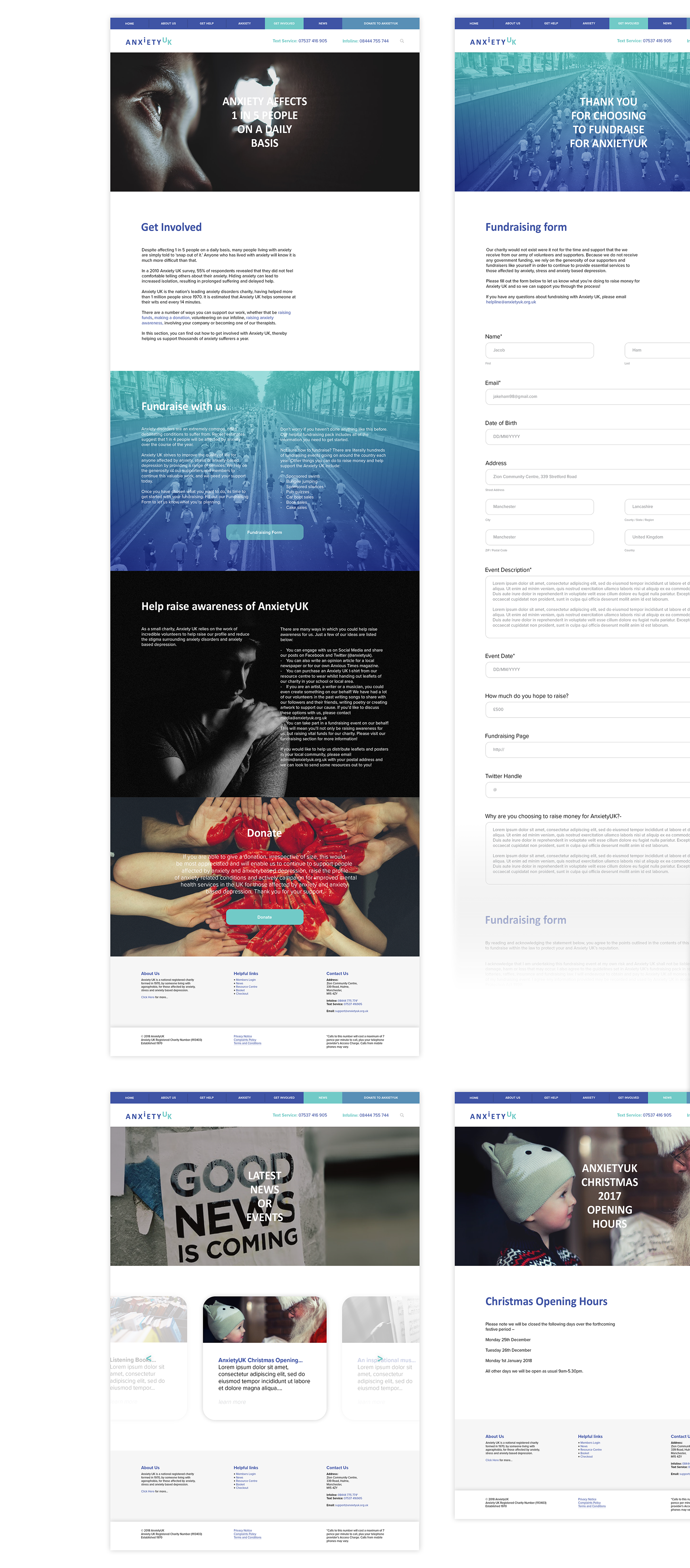
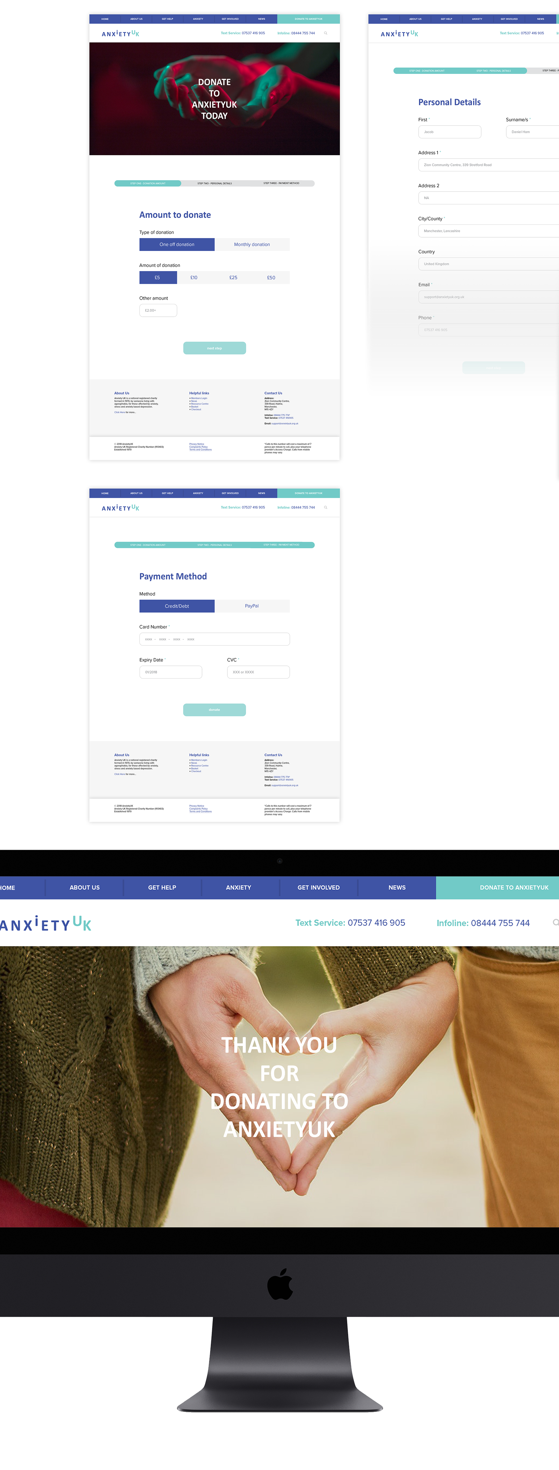
Website design
During the early stages of research back in October, I wanted to see if this project was worthwhile from a design perspective. I felt that the website lacked a lot of consistency and needed to feel more modern, there were a few issues such as a white outline on the logo. Therefore I decided to create a redesign of the site that would tie in with the rest of the branding. The photographs used in the design are sourced from Unsplash, the purpose of using stock imagery was to allow me to highlight more features such as the reel of anxiety types. The website was designed for Desktop, Tablet and Mobile using a mixture of the Adobe CC Suite.
iFEEL Mood App
Aside from creating the branding and campaign for the brand, I wanted to create an app that would technically become a sub-brand of "AnxietyUK". The name for the app is inspired half of the theme of the logo design. This being how about "i" feel, which is the purpose of the entire app. To record, correlate and outline feelings of the user. The app will allow anyone to see trends such as low points, and an average mood across the current month or year. The app was designed using both Adobe Photoshop and Adobe XD allowing myself to create a fully functional prototype that can be shown to highlight how the app would work in any given environment.
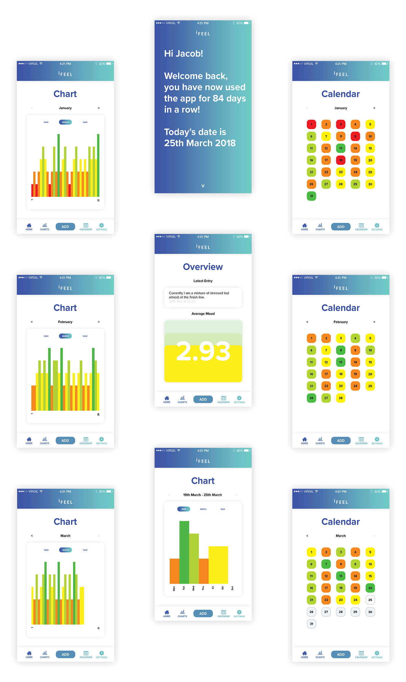
Navigation, Animation and a working prototype
To highlight the purpose of the app, I created a small Adobe XD prototype and screen-recorded them using my iPhone. This mainly is to show the function of the app, and working animations. I mainly used fade and push-up or down.
Start up
When starting up the app, it needed to be fluent and fast, being both incentive for returning users and clear. The app allows the user to gain an average score on mood, this can be changed to monthly or yearly.
Charts
One of the main aspects of the app is the charts system, this works together with the home page of the app to create a average out of 5. The charts also link with the calendar to allow the user to find trends in mood across weekly, monthly and even yearly.
Add mood
The main feature of this app is to be responsive to the users input, when a new mood is added the user can add the following information; Summary of mood, Rating of mood and Date of Entry. This information will change a lot on the app from the charts section, to the calendar and the average mood. The app automatically chooses time.
Brand Guidelines.
The final aspect of this project was to create a set of printable a4 guidelines that will outline strict guides for every aspect of the brand from the values, logo design and even the website. These were extensive featuring suggested print specs or formats for printing.
Special thanks
To end this case study, I really want to thank a few people who have helped me whenever I've been low, felt on edge, been there for me when I needed a laugh or someone to talk too. I wanted these people to be the face of the project, simply when I look back in 5-10 years time, I'll be reminded of a few who stood by me through this period of my life and have done since day one.
Photographer
Matthew Perry
Modelling
Brea Ross
Ryan Morgan
Luke McGowan
Luke Potts
Nick Wetherell
Scott Bainbridge
Thanks for scrolling
This project has changed my life, it's simple as that. I'm grateful to have a platform to share a story like this and something I am extremely passionate about. Trust me, if your going through something similar just remember you are not alone, it does get better. There is always a light at the end of the tunnel.
Let me know what you think of this project, and any feedback is greatly appreciated.
Be sure to follow me on Dribbble, Instagram and Twitter for more regular updates, even about future similar projects.