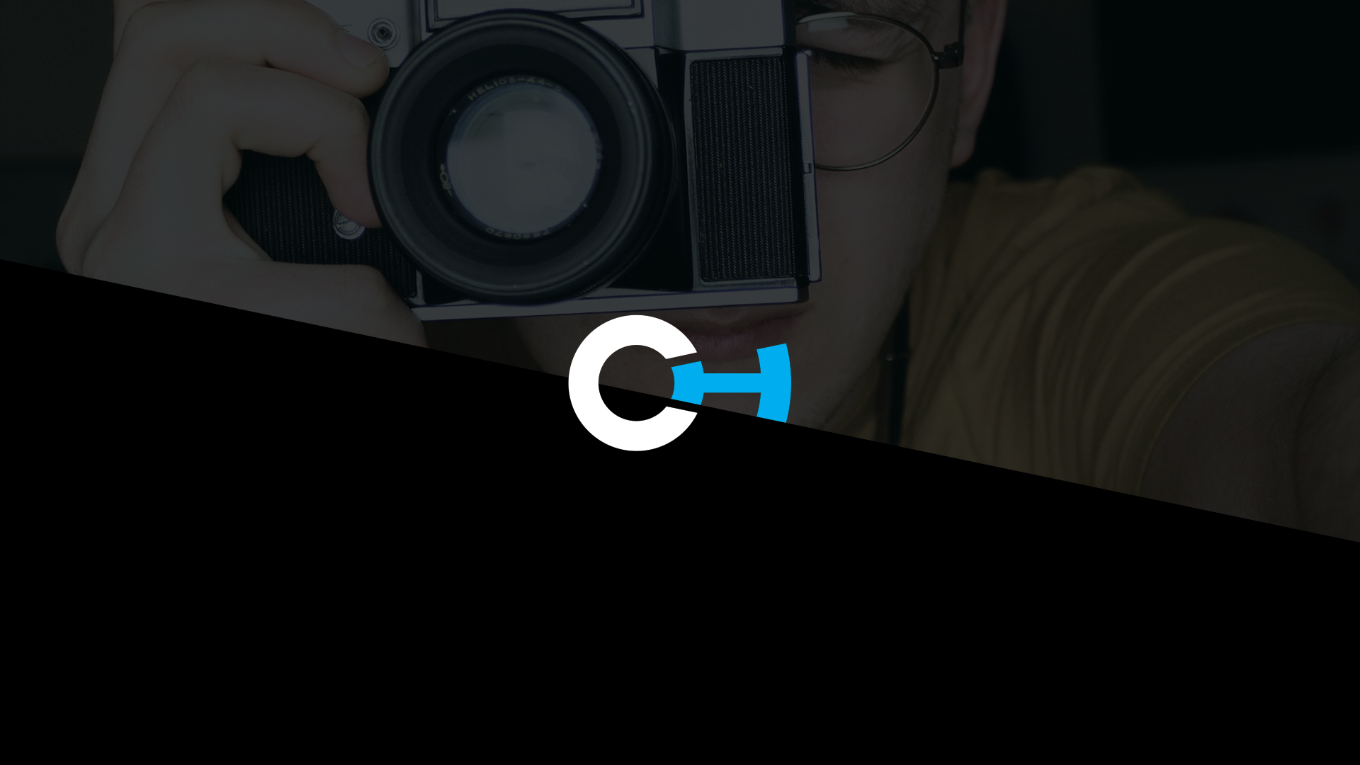
Callum Hodgson
To create full corporate branding for a first year Photography student from The University of Sunderland. This project should include: logo design, business cards, letter heads and website design that all adhere to a set of guidelines developed throughout the brief.
Callum is currently studying Photography, Video and Digital Imaging at The University of
Sunderland. His work is based in the North East of England; however has travelled internationally for projects which fuel his passion for the arts. This not only inspires, but it educates him on cultures and what our world is about.
Currently, he is producing a number of projects that include traditional processes in dark rooms with the use of both modern and historical equipment and lighting. Callum explores and bases an understanding of all areas he encounters within photography and heavily research these areas. This acts as a diary to shows progression and reflection.
When he graduates from The University of Sunderland he plans to have built a portfolio which has evolved into a style and undergone many techniques. This can range from a conceptually driven piece to photographing portraits and events. With all of this experience, Callum hopes to establish my own studio and complete work as a freelance photographer with links to other companies and institutions globally.
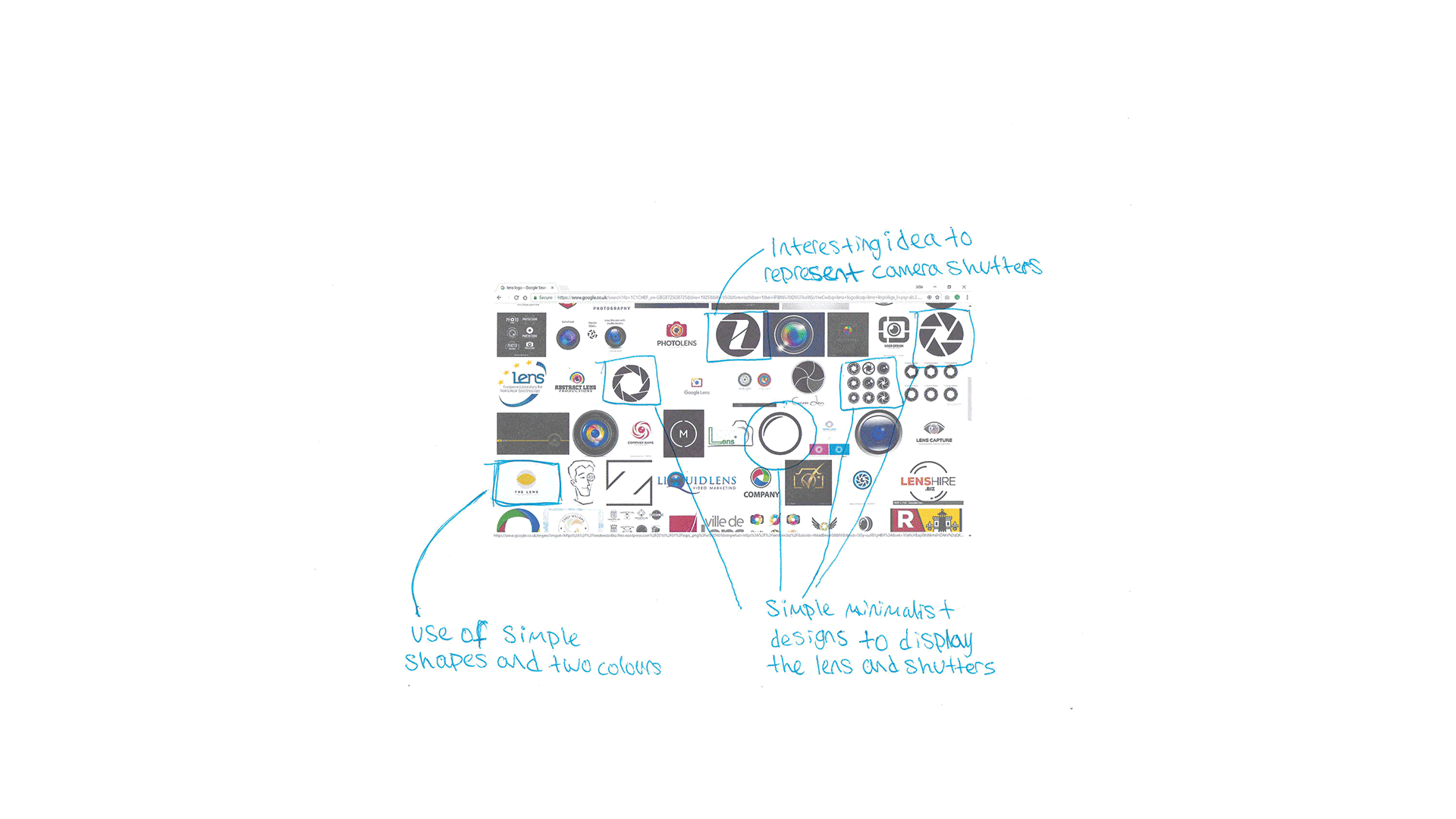
Moodboard and Research
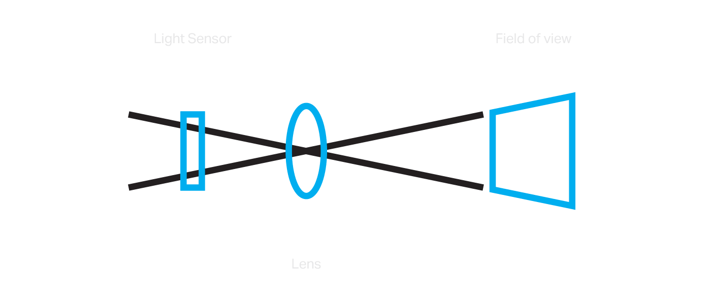
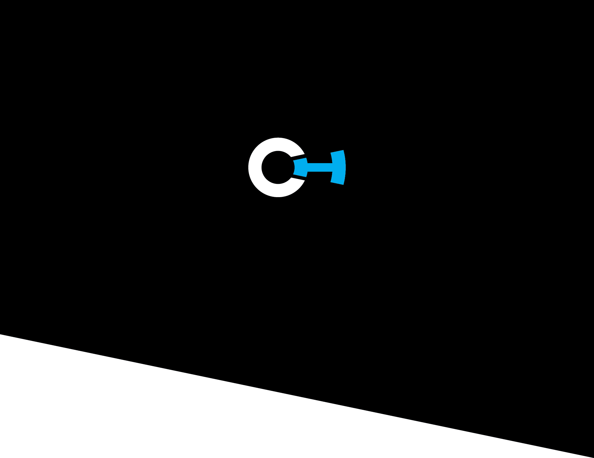
Every project starts with researching and creating a bunch boards around themed that the concept could be based on. In this instance, it involved the process of how the light from the area of focus travels through the camera lens to the light sensor. This process is clearly an essential element of how photography works, therefore an appropriate idea to tie into the logo.
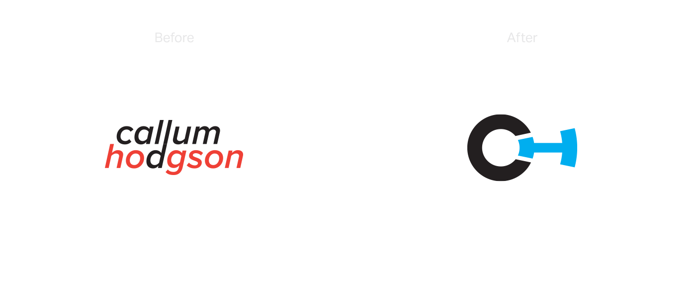
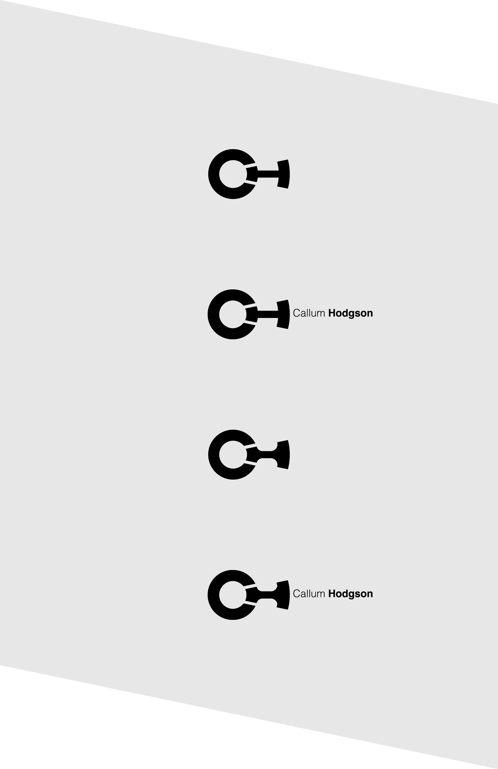
Designing the logo
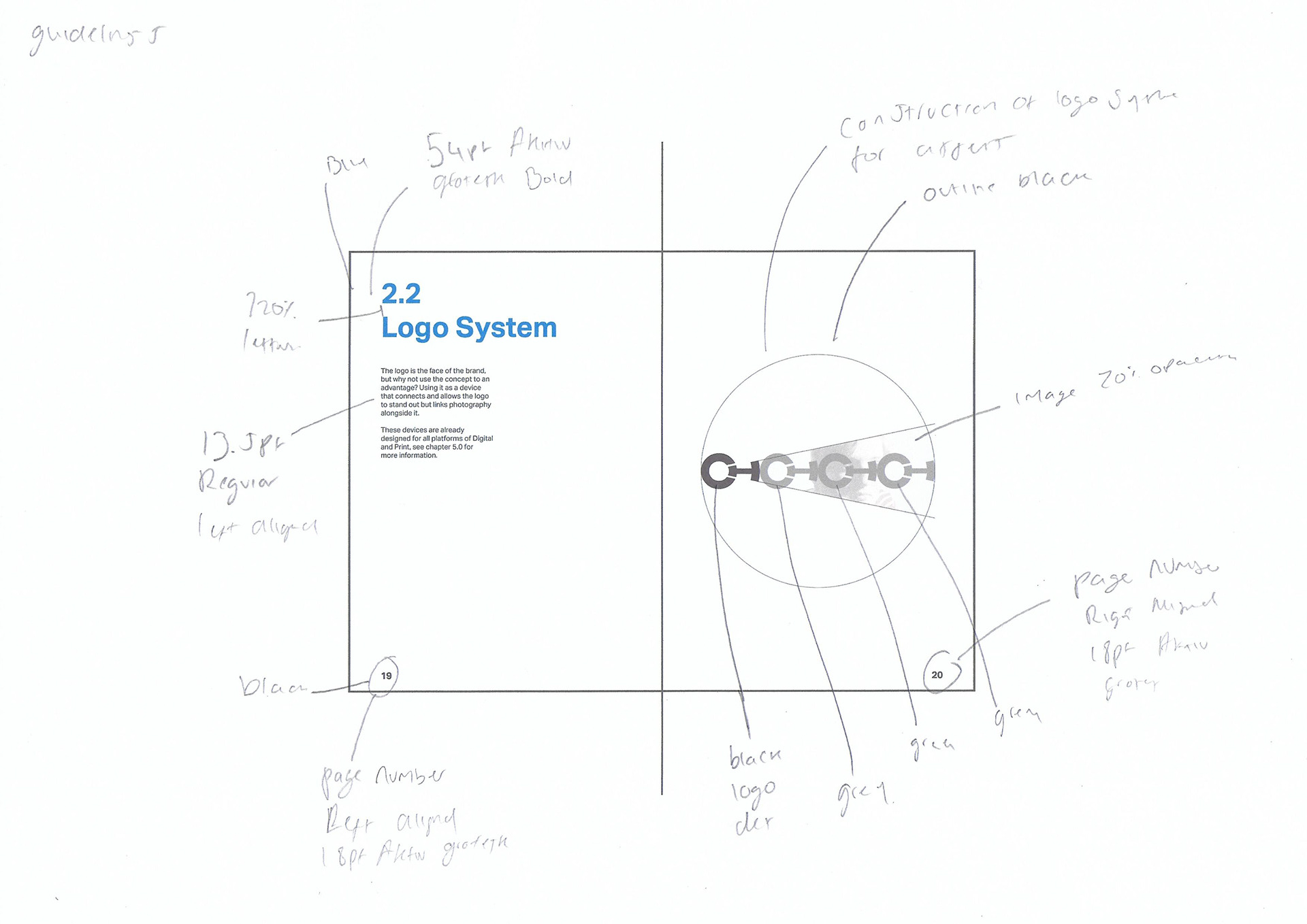
The process of designing the logo was inspired by the diagram of the camera lens, we tied this with the client’s initials (CH) which are positioned to represent the crossing lines of light reaching to a camera light sensor.
Presentation and feedback.
We presented a wide range of both colours and design variations to the client and was given the following feedback...
"Great use of my initials into the photographic field. Use of a 'lock and key' arrangement and colour given to the 'H'. A different, calmer colour could be used instead of red."
- callum hodgs on
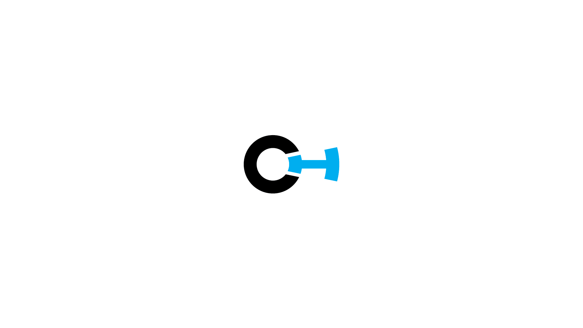
Final Design
The final logo needed to be clear, fresh and adaptable to work with a wide range of both colours and photography. Therefore it was best to keep a three colour system that would rotate to be used in various situations. We presented the above revisions to Callum and gained feedback to finalise the design completely.
"I am extremely pleased with the outcome for design. The experimentation of colour in this section made my decision easier as to which colour would work with my brand the best which is light blue"
- callum hodgson

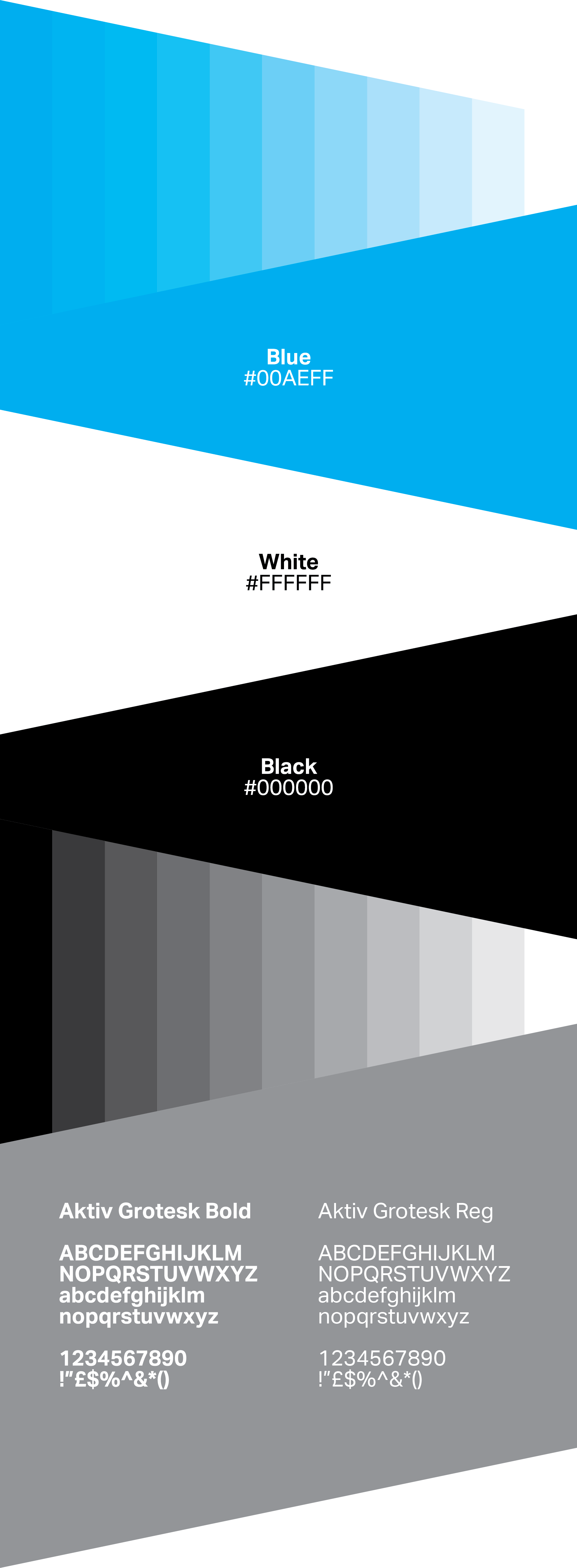
Colour
The colour choice is to represent stability and strength with calming and positive connotations. This is a colour which would tell any client that you are confident in your work.
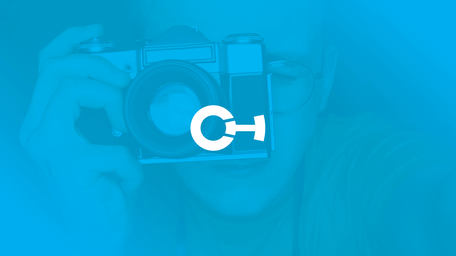
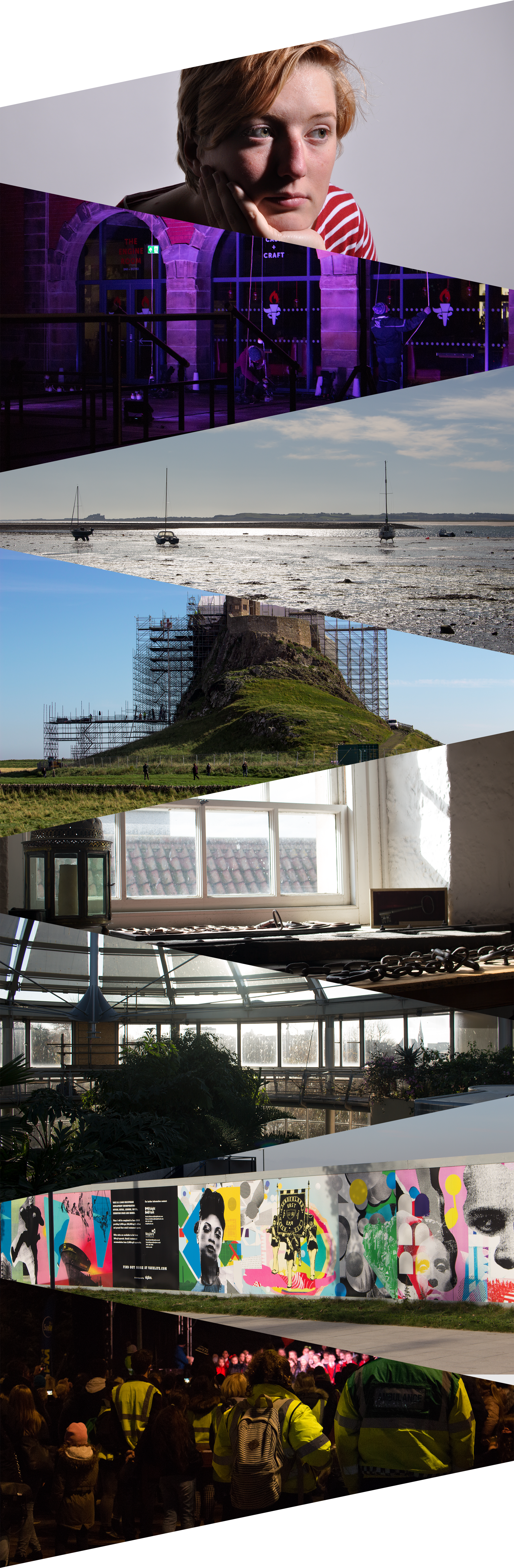
Brand Photography
To help kick-start the brand, we wanted to showcase the best but a wide range of photographs we selected eight photographs to use within the branding combining them with the logo to create a style that would keep Callum's branding unique and promote his work.
In the future, these will be expanded on whenever Callum develops other projects.
Brand System
Every brand should be distinctive from one another, and this was no different for this project. We wanted the brand to focus on the logo, therefore we decided to create a system that tied perfectly with the logo and the photography.

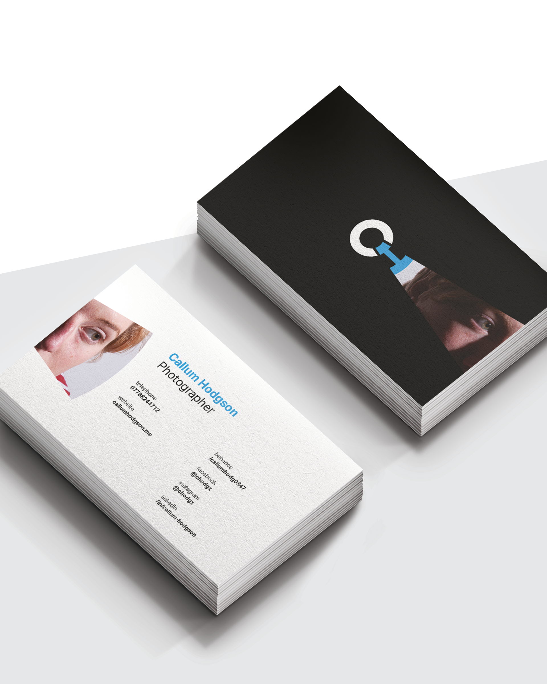
Brand Assets
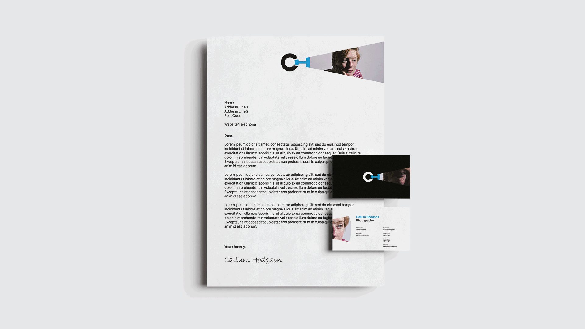
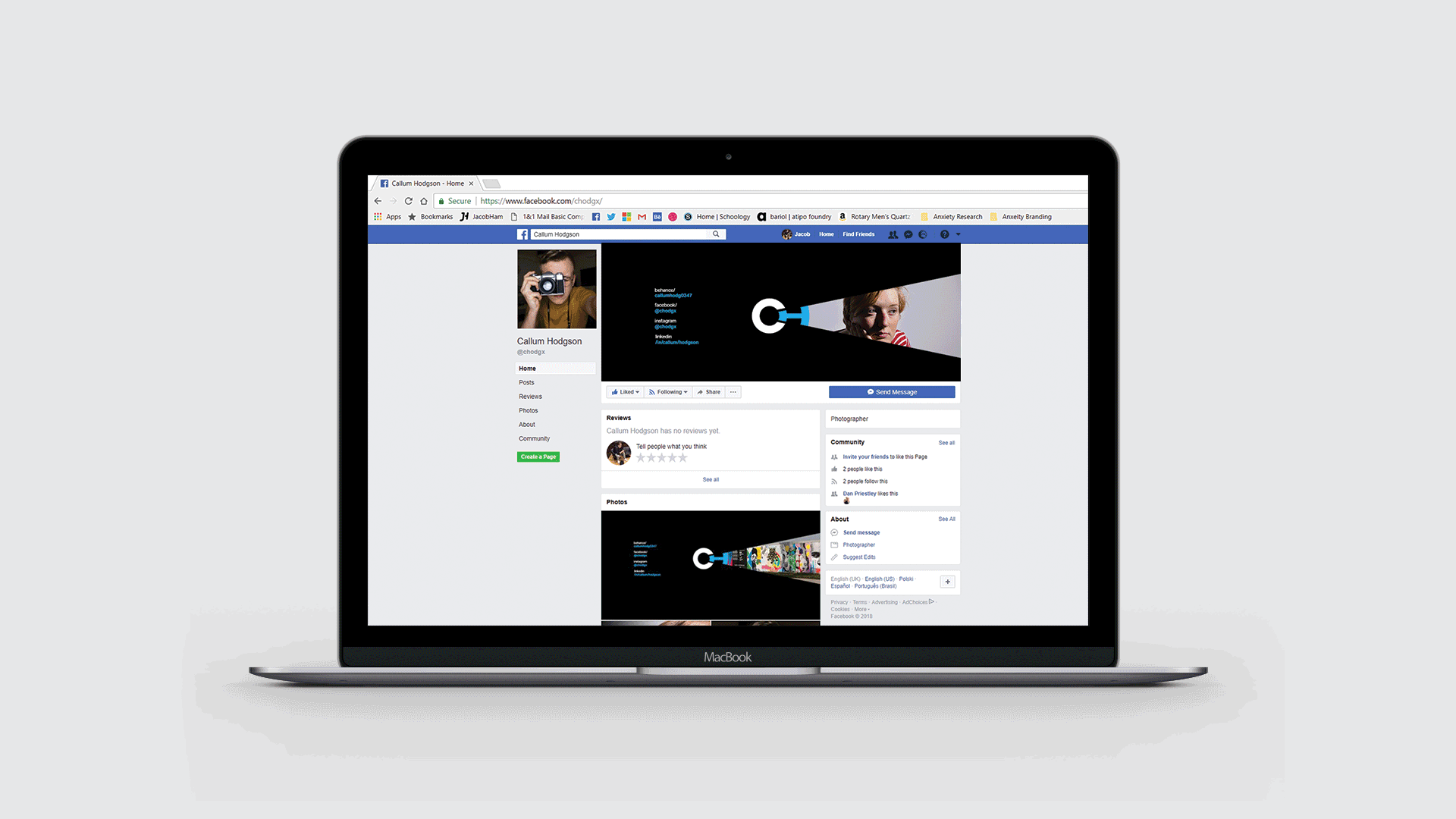
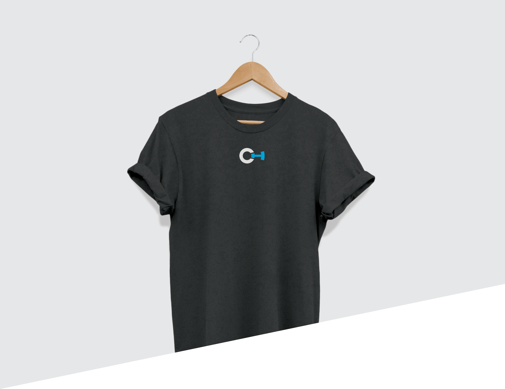
To establish the brand, we created an extensive range of assets that are both suited for Digital and Print. This would allow, Callum to promote his work both online and locally. These would highly benefit his brand, to gain exposure prior to him graduating from University.
What we created?
- Business Cards
- Letter Heads
- Social Media Banners
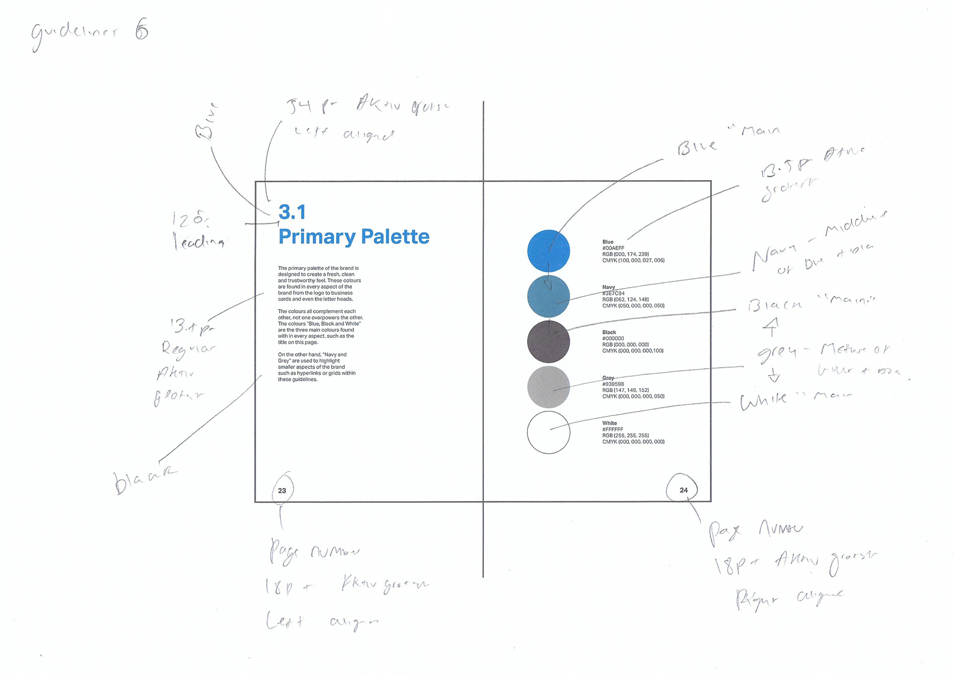
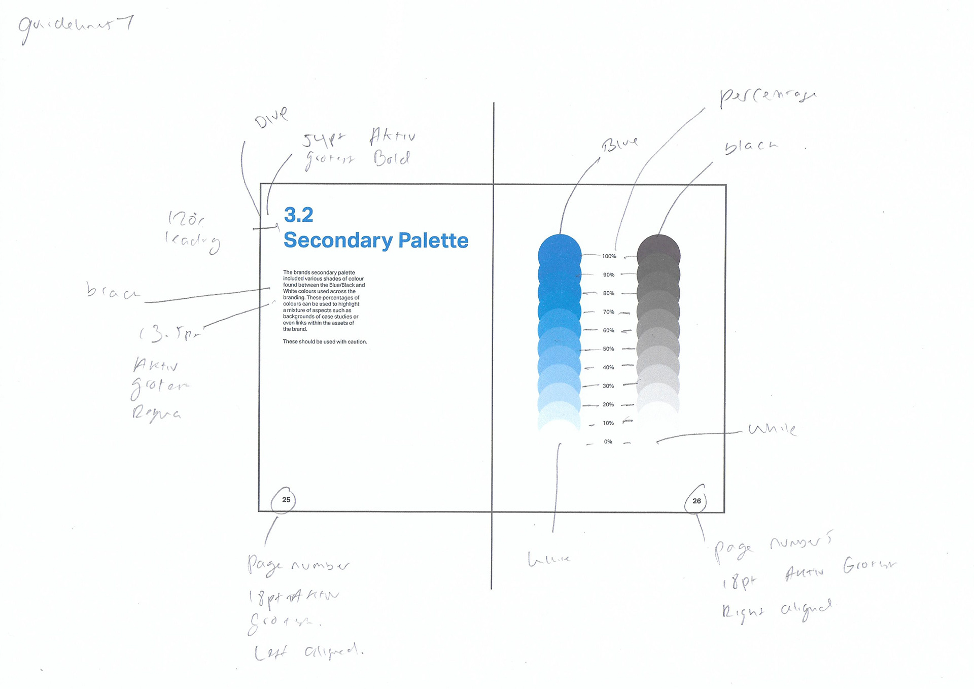
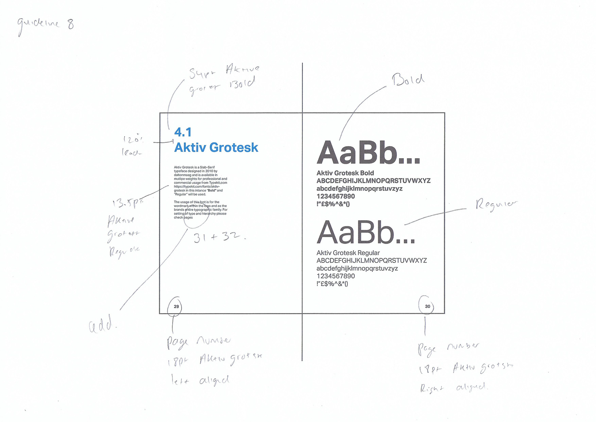
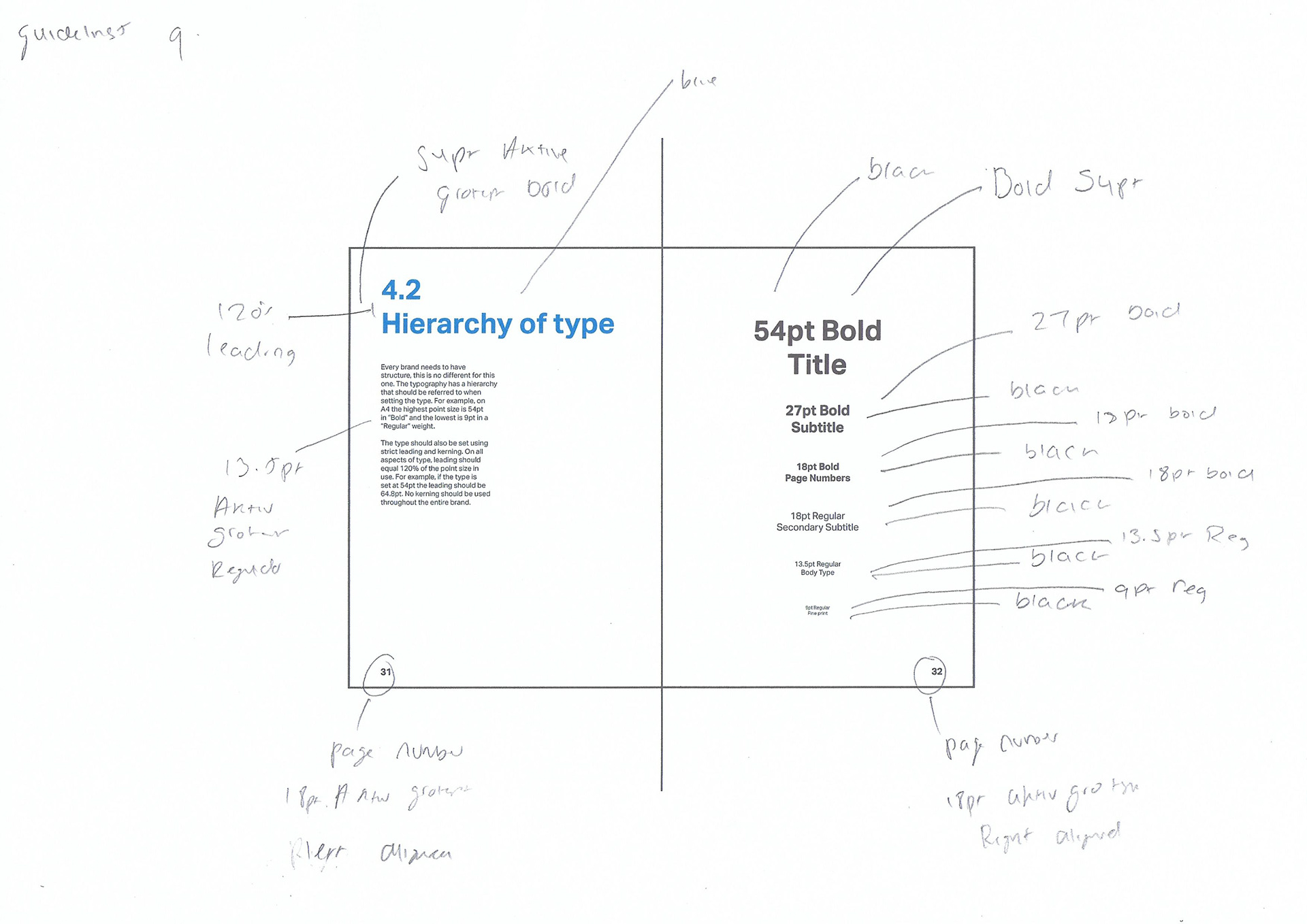
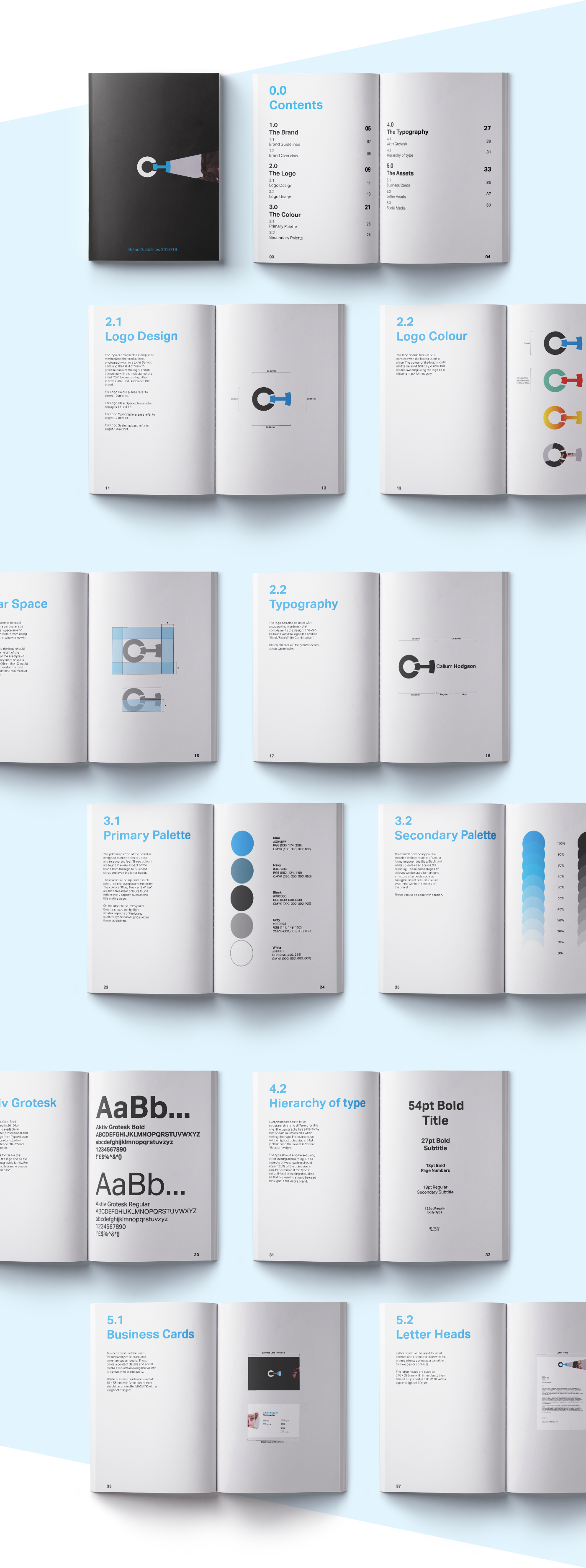
Brand Guidelines
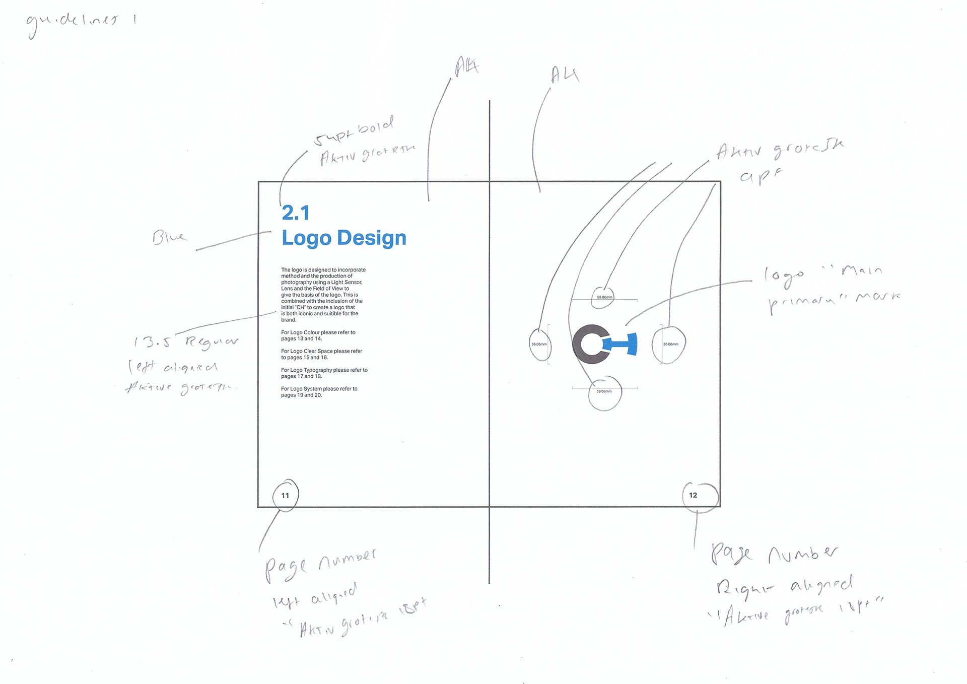
We decided to wrap up this project by creating a set of A4 Brand Guidelines that will allow the brand to stay intact, these were focused around Logo Design, Colour, Typography and Assets.
Thank you for watching!
Logo design
Matthew Perry
Brea Ross
Jacob Ham
Branding
Jacob Ham
Matthew Perry
Client/Photographs
Callum Hodgson